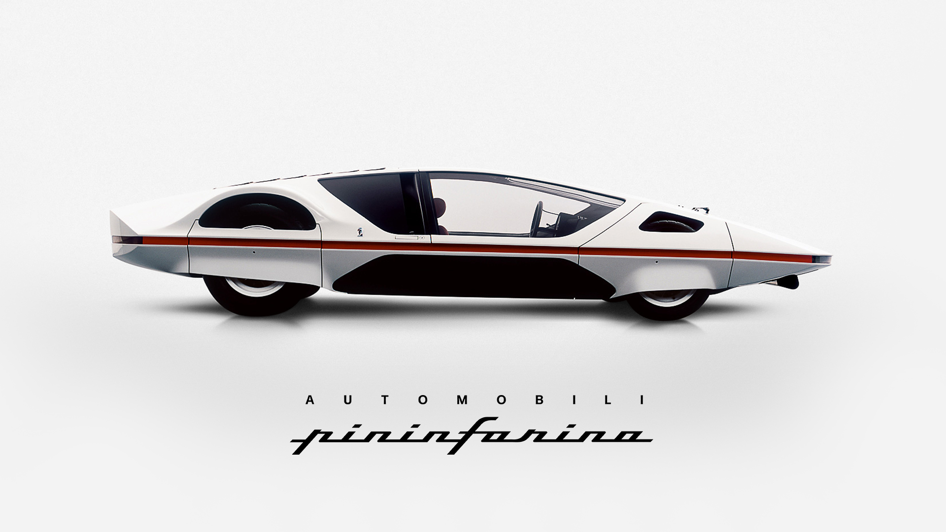
Pininfarina is the name behind some of the most iconic and classic designs in automotive history. Its founder, Battista “Pinin” Farina, wished to one day do more than merely design cars for other brands. He dreamed of building his own car. Automobili Pininfarina exists to make that wish come true, a pioneering new business conceived to create create zero emission vehicles.

While Pininfarina needs no introduction to the luxury and automotive industry, Automobili Pininfarina is a complete new company and needs to define a brand strategy and identity to bring its vision to life. Based on that need, the approach focuses on cutting edge technology and design. Work that not only defines a brand positioning, but also establishes a communication strategy and roadmap to approach a unique group of high-net-worth-individuals: knowledgeable in luxury, environmentally focused, uncompromising in their taste. The work complements this strategic necessity through a visual identity and a toolkit for exclusive communication.

redesigning an icon

Battista “Pinin” Farina had very simple but firm design principles: every line, shape and volume must always follow simplicity and harmony in order to create an object whose beauty will stand the test of time. The Automobili Pininfarina logo is streamlined according to Battista’s concept – becoming a versatile symbol with a strong, lasting impact and a wide range of practical applications.

The icon in use.

The typographic logo on its own and in combination with the icon.

Colours & Materials

The colours and materiality of Automobili Pininfarina are not only informed by the technical advancements of the car itself but also by the Italian craftsmanship involved in the design and construction of the vehicle. The logo, inspired by the inherent beauty of nature, becomes a symbol of the appreciation for purity.

The right type

Building further on a rich Italian design heritage with an eye to the future, Forma DJR is the typeface of choice. Originally cut in 1968 by Turin based type foundry Nebiolo as a break away from traditional and popular fonts of the time, this new digital revival maintains modernist precision while allowing for a human touch to shine through.

© 2019 Amsterdam Worldwide Imprint